Nassim Hadj benali


Yassir is a super-app with 8M+ users across six countries, offering ride-hailing, intercity travel, parcel and food delivery, flight booking, and digital financial services.
Open this case

Project Title
Ride Radar feature
Project Description
Ride Radar is a shared ride marketplace for eligible drivers to find and accept trips not covered by standard dispatch. As Lead UX Designer, I redesigned the driver experience to improve discoverability, speed of decisions and trust in available rides. Daily driver engagement increased from ~75% to 90%+ after launch and Radar acceptance nearly doubled relative to regular ride acceptance.
CompanyYassir Inc., United StatesProduct areaMobility / Driver appMarketsMulti-country rolloutPlatformsiOS, Android, operations dashboard
Timeframe
September 2025 - Present
Understand

Context
Yassir’s dispatch model sent ride requests to drivers one by one. When multiple drivers declined or missed a trip, the ride could remain unserved, hurting utilization and rider experience.

Problem statement
In the classic dispatch model, drivers receive ride requests one by one. When a trip isn’t accepted after several attempts, it can remain unserved—reducing trip utilization and degrading the rider experience.

My Role
I led UX for the Radar driver experience, including the mental model, information architecture, card redesign, home entry point, acceptance states, edge cases, and rollout iteration with Product, Engineering, QA, and UX Writing.
Constraints
First things, first !
Radar had to increase ride acceptance without creating driver confusion, unfair competition, or safety risks.
We designed around six constraints: marketplace efficiency, driver agency, safety, trust, clarity, and information density.

Marketplaceefficiencyincrease trip acceptance without creating unfair competition.

Driver agency let drivers choose rides without overwhelming them.

Safetyavoid encouraging distracted decision-making while driving.

Clarity explain exclusive vs. shared rides in language drivers understand

Trustkeep ride availability fresh and remove stale inventory.

Densityfit enough information on the card without hurting scanability.
Radar’s Key Decisions
How does it work?How rides enter Radar?
Rides start in normal dispatch. If not accepted after a predefined number of attempts, a trip becomes visible in a shared Radar list to eligible drivers within pickup radius
Driver 1 Declines
Driver 2Declines
Driver XDeclines
Ride dispatch
Drivers receiveindividual Ride requestas an overlay
Ride radar
Ride lands in a market/pool to increase its chances to be taken


Decision 1New Mental Model
From “push-only” → “pull + browse”
Before: Dispatch interrupts you. You react.After: Radar lets you browse options and choose intentionally.This changed the driver experience from reactive acceptance to intentional selection.In other terms, the core design challenge was not just adding a list of available rides. It was changing the driver’s relationship with dispatch, from reacting to interruptions to intentionally choosing profitable trips.
Decision 5“The biggest UX conflict”
Browse mode vs interruptive requests
Radar introduced a new browse mode, where drivers could intentionally choose among available rides. But standard ride requests still showed as blocking overlays, interrupting that browsing flow. This created a behavioral risk: drivers might reject incoming requests just to continue browsing Radar, which could damage their performance score, increase cancellations, and diminish future earning opportunities
Decision 6Make ride availability understandable at a glance
Radar added a new clarity challenge involving some rides that were exclusive only for one driver, and some for multiple drivers.
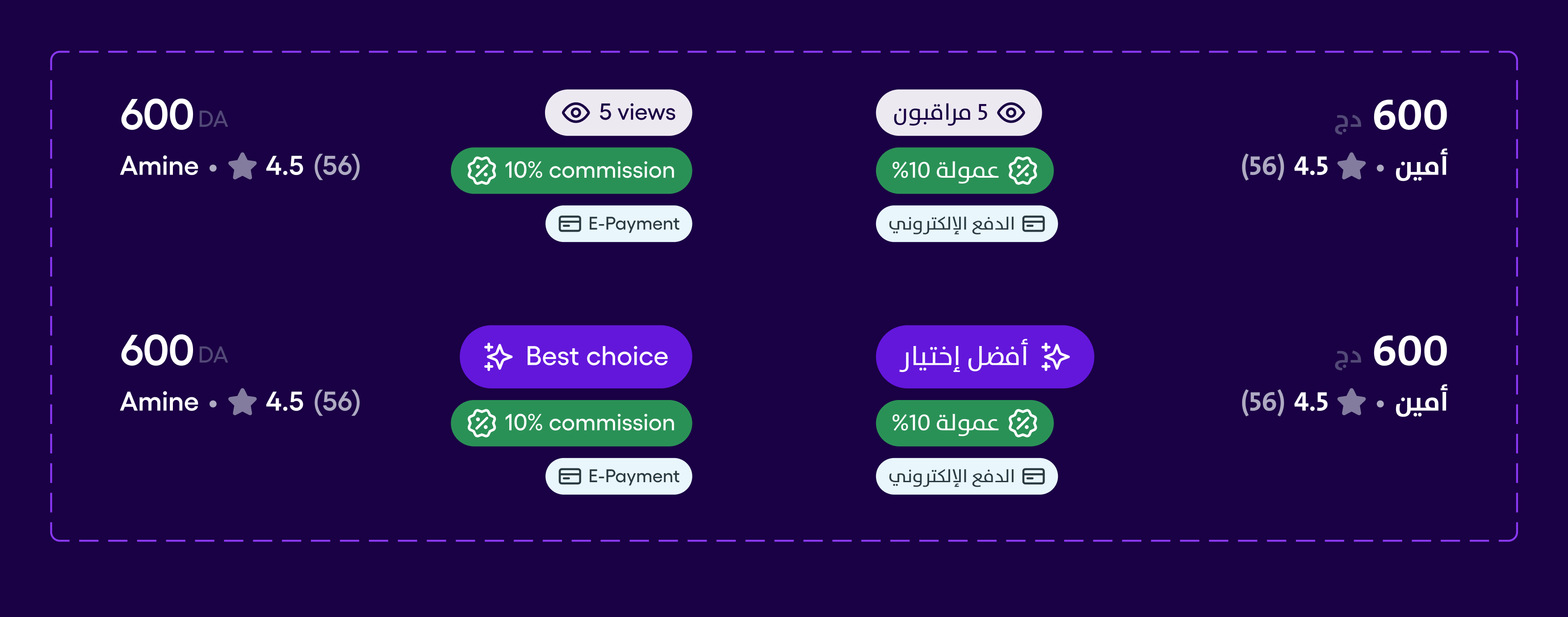
We worked with UX Writing to make availability clearer, rather than showing technical statuses like “Exclusive” or “Non-exclusive.” Reserved rides were rebranded with value-based labels such as “Best deal” / “Best choice” and shared rides included a viewer count to communicate both competition and urgency.
Decision 2Pushed for Discoverability
Introduced a home entry point for direct access with lightweight tooltip onboarding.
Ride radar was accessible through the user menu which made its discoverability very hard, most drivers barely noticed the feature at all.The decision to create a second entry point for drivers was a game changer. To push the discoverability even further, the choice of a dynamic button was almost inevitable, as it served as a sneak peak into the radar’s activity.
Decision 4Live inventory expectations
Radar must feel “real-time enough”
Accepted rides should disappear quickly. Timed-out rides ought to be removed as well. This will guarantee this feel of “Live inventory” for the users by automatising the management of cards and a refresh of the list for “X seconds”.

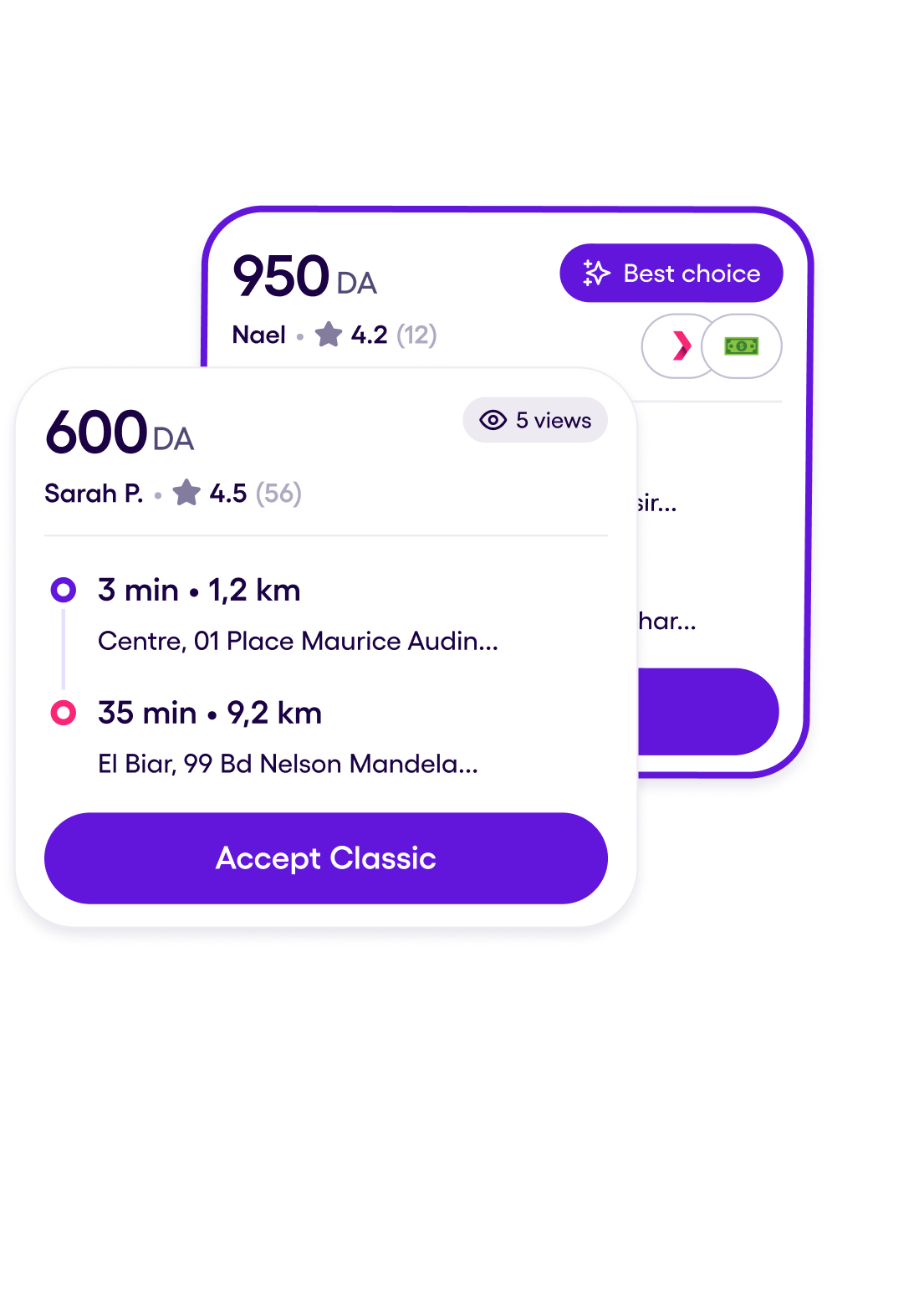
Decision 3Redesign the ride card around fast profitability scanning
...and safety. This was especially important because many drivers had varying levels of digital literacy and made decisions in high-distraction environments.
We prioritized price, pickup ETA, distance, payment method, rider info, and itinerary because these were the strongest decision factors for drivers.
Original Trip request Card


NEW card
Shrinking the card size was essential since it was the primary limitation; the cards must contain all key information for the driver’s decisions while also fitting as many cards as possible on the screen.
Data + User insights
ETA-to-pickup is a key acceptance for drivers. Our main findings “If ETA exceeds ~8–15 minutes, drivers often will not accept the ride”. This led for the decision to replace “the district name + Address” by “ETA + Address”. The drivers now have better scanability for the factors that matter most in their decision to accept a ride.


“I never accept far pickups, it’s a waste of gas and I know, the ride won’t be so profitable”

Default


1st Section
2nd Section
CTA
Ride details
Rider information
Number of drivers viewing
Price
ETA + Address
Itinerary details
Main CTA
creates urgency and communicates competition
drivers assess profitability before effort
Drivers compare distance and time together

Edge cases


1st Section
2nd Section
CTA
Ride details
payment method affects acceptance preference
All tags are grouped together to inform for Service, ride type, commissions & Payment Method
Price
ETA + Address
Itinerary details
Main CTA
Payment methods
Design System
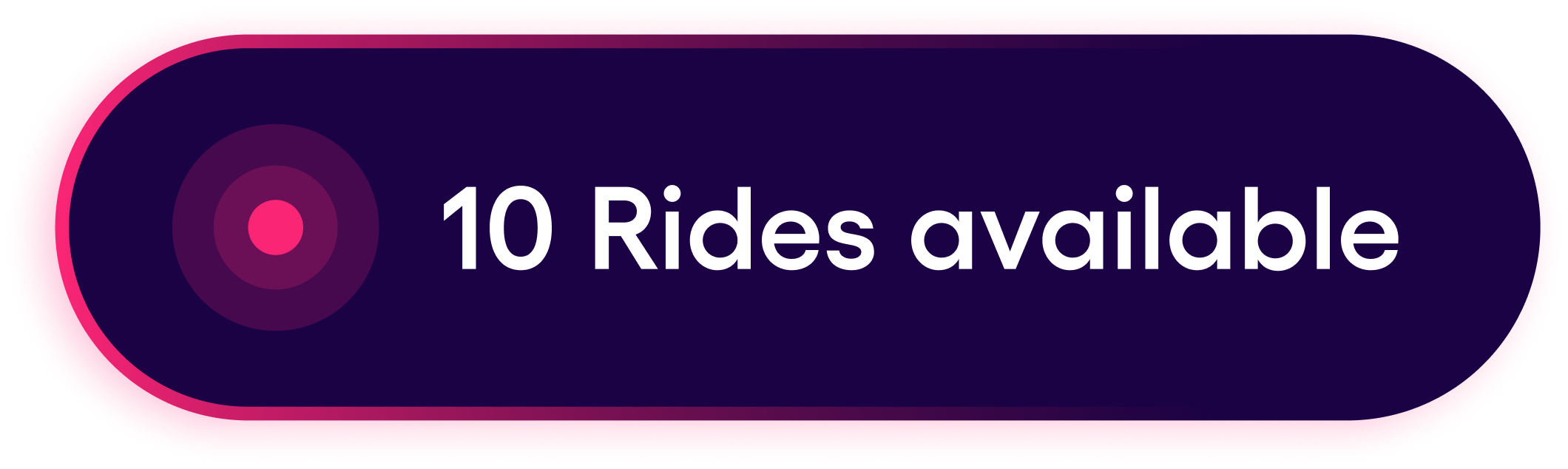
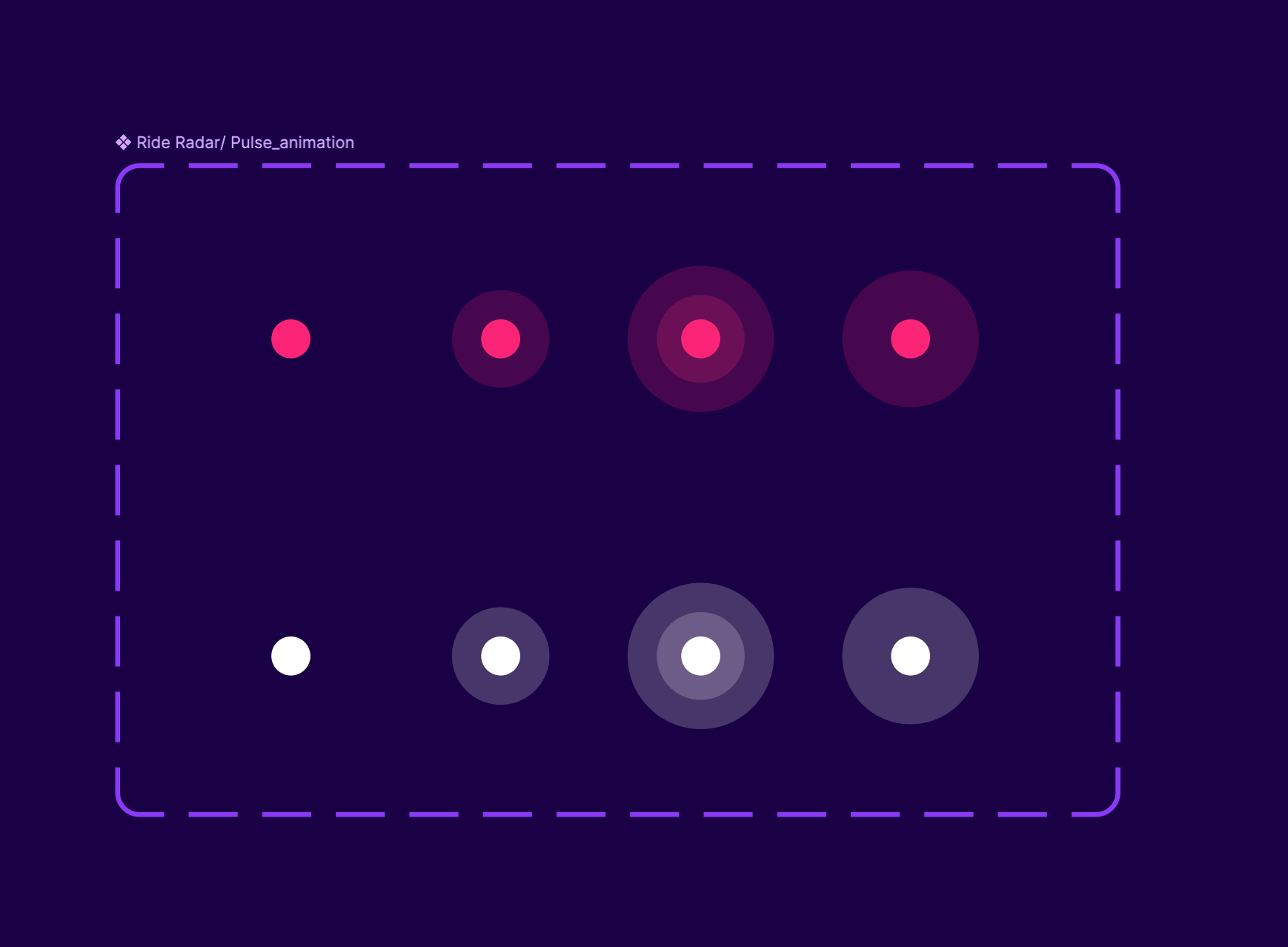
Dynamic Button Biggest funnel, easy acquisition, clarity, attracts attentionWe used a dynamic entry point to increase Radar discoverability without permanently occupying screen space.
The button adapted between collapsed and expanded states, revealing the number of available rides when there was activity. This created a lightweight sense of urgency while keeping the home screen clean.
The mechanism was also tied to the driver’s availability status: when drivers were online, Radar could surface active opportunities; when they were offline, the entry point stayed inactive to avoid misleading them.
The button toggles between collapsed and expanded state after ‘X’ seconds to show the user the number of available rides.


Reusable card pattern
The Radar card is one of the most complex patterns in our library. It is tied to so many other foundational features of the product, pricing, boost feature, surge feature, Financial services,... Both building such versatile component and the Alignment with all respective stakeholders were undertaken with surgical precision.
Main header component contains other nested components such as: Price, payment methods, commissions, rider information,...


Main header component contains other nested components such as: Price, payment methods, rider information,...
Price Component
Results
90%+
Driver engagement increased from ~75% daily average to 90%+
↑
Significant increase in radar acceptance / fetched rides
x2
Radar acceptance vs regular acceptance nearly doubled

Radar Deployment
Daily driver engagement with Radar after the Radar V2 launch increased from ~75% to 90%+. Radar acceptance also nearly doubled compared to regular ride acceptance during the observed period. All market-level details are anonymized.
Beyond Radar
Boosting the “Boost feature”
Revamp of the pricing component by adding our brand new green tokenWe later seized the opportunity of a very high adoption of the Radar and introduced a slight change to the UI of the pricing component to try to solve the low adoption occurring in the boost feature during the rider’s trip request and increase awareness of th feature.

“2nd Milestone”
Regular ride requests
As we speak, another milestone was reached as all stakeholders agreed to utilise the same radar card design for regular ride requests outside the Radar. The old design was too cluttered which led to high cancellation rates. Drivers usually prefer not to engage because of high cognitive load adding to that drivers are mostly in the car reading from a distance. For the same reasons, all labels failed to inform drivers of opportunities like: Commission reduction, payment methods, Best deals,... Seeing the impact of radar design spreading across the whole product was certainly a victory for the Mobility team, especially the ride requests flows which represent a pillar in our Partners App.


Home


Go Back Up

Next Case
Nassim Hadj benali

Yassir is a super-app with 8M+ users across six countries, offering ride-hailing, intercity travel, parcel and food delivery, flight booking, and digital financial services.
Open this case
Project Title
Ride Radar feature
Project Description
Ride Radar is a shared ride marketplace for eligible drivers to find and accept trips not covered by standard dispatch. As Lead UX Designer, I redesigned the driver experience to improve discoverability, speed of decisions and trust in available rides. Daily driver engagement increased from ~75% to 90%+ after launch and Radar acceptance nearly doubled relative to regular ride acceptance.
CompanyYassir Inc., United StatesProduct areaMobility / Driver appMarketsMulti-country rolloutPlatformsiOS, Android, operations dashboard
Timeframe
September 2025 - Present
Understand

Yassir’s Ecosystem
My contribution at Yassir
Product
Services/Squads
Projects I worked on


Mobility


B2B
Dash OPS
InterCity
Foundation Colors(Revamp)
Rider app Revamp
Food Delivery
Financial services (Wallet)
Airline Booking
Patterns
Components
Foundations
B2B Ride Hailing
Admin Panel
Ride Hailing
(VTC)
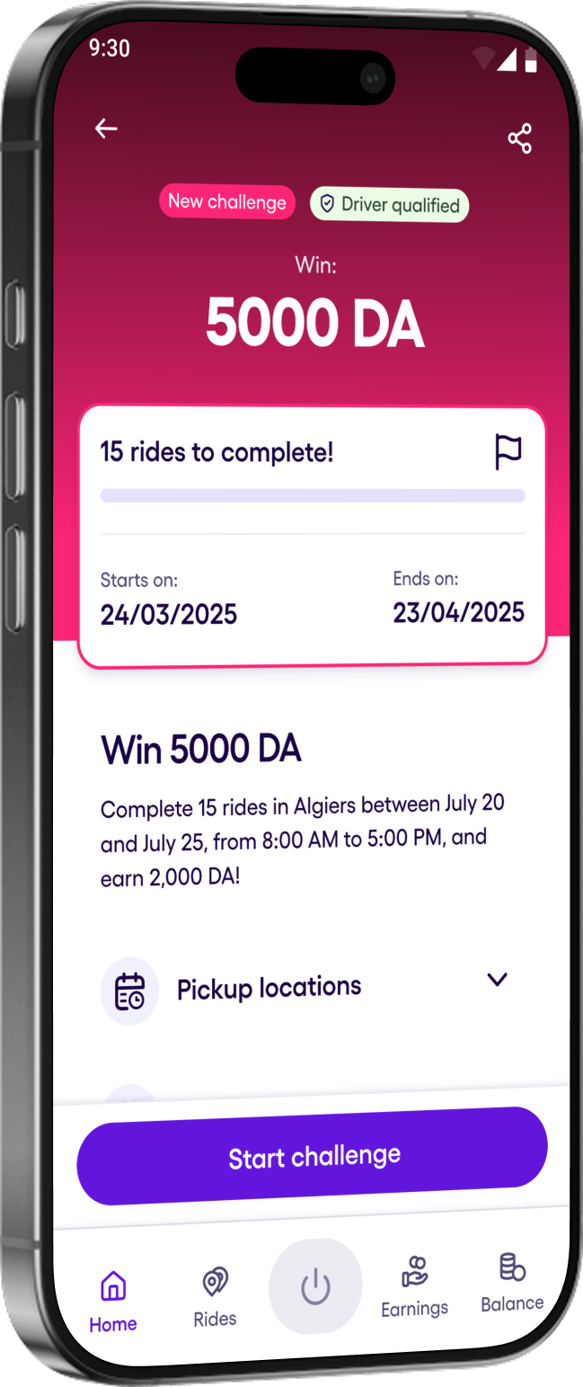
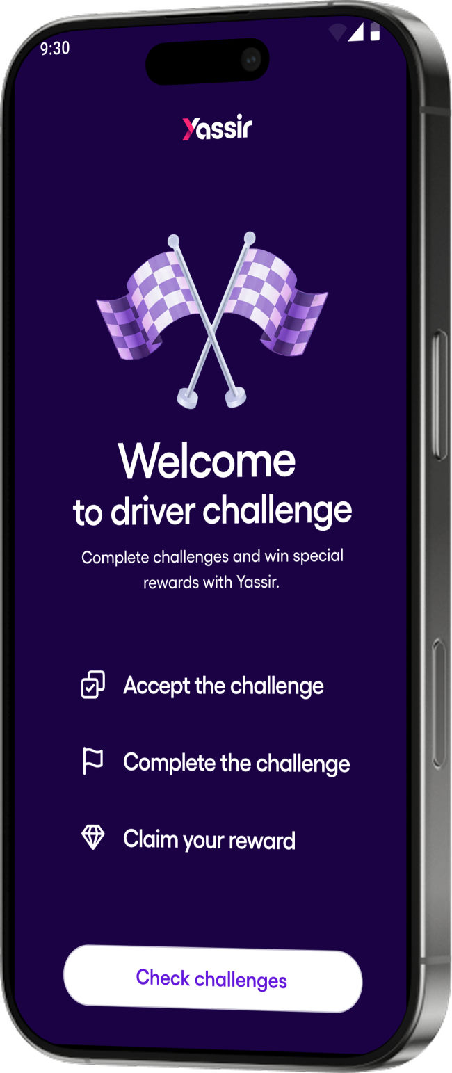
Driver Challenge
Ride Radar
Onboarding businesses
...
...
...
...
...
Driver Retention
& Performance
Driver Onboarding
Trip Request
Driver App
Super app(B2C)
Design
System(SEFAR)

...
We are here !
Acquisition
Context
Yassir’s dispatch model sent ride requests to drivers one by one. When multiple drivers declined or missed a trip, the ride could remain unserved, hurting utilization and rider experience.
Problem statement
In the classic dispatch model, drivers receive ride requests one by one. When a trip isn’t accepted after several attempts, it can remain unserved—reducing trip utilization and degrading the rider experience.
My Role
I led UX for the Radar driver experience, including the mental model, information architecture, card redesign, home entry point, acceptance states, edge cases, and rollout iteration with Product, Engineering, QA, and UX Writing.
Constraints
First things, first !
Radar had to increase ride acceptance without creating driver confusion, unfair competition, or safety risks.
We designed around six constraints: marketplace efficiency, driver agency, safety, trust, clarity, and information density.

Marketplace efficiencyincrease trip acceptance without creating unfair competition.

Driver agency let drivers choose rides without overwhelming them.

Safetyavoid encouraging distracted decision-making while driving.

Clarity explain exclusive vs. shared rides in language drivers understand

Trustkeep ride availability fresh and remove stale inventory.

Densityfit enough information on the card without hurting scanability.
Radar’s Key Decisions
How does it work?How rides enter Radar?
Rides start in normal dispatch. If not accepted after a predefined number of attempts, a trip becomes visible in a shared Radar list to eligible drivers within pickup radius
Driver 1 Declines
Driver 2Declines
Driver XDeclines
Ride dispatch
Drivers receiveindividual Ride requestas an overlay
Ride radar
Ride lands in a market/pool to increase its chances to be taken


Decision 1New Mental Model
From “push-only” → “pull + browse”
Before: Dispatch interrupts you. You react.After: Radar lets you browse options and choose intentionally.This changed the driver experience from reactive acceptance to intentional selection.In other terms, the core design challenge was not just adding a list of available rides. It was changing the driver’s relationship with dispatch, from reacting to interruptions to intentionally choosing profitable trips.
Decision 5“The biggest UX conflict”
Browse mode vs interruptive requests
Radar introduced a new browse mode, where drivers could intentionally choose among available rides. But standard ride requests still showed as blocking overlays, interrupting that browsing flow. This created a behavioral risk: drivers might reject incoming requests just to continue browsing Radar, which could damage their performance score, increase cancellations, and diminish future earning opportunities.
Decision 6Make ride availability understandable at a glance
Radar added a new clarity challenge involving some rides that were exclusive only for one driver, and some for multiple drivers.
We worked with UX Writing to make availability clearer, rather than showing technical statuses like “Exclusive” or “Non-exclusive.” Reserved rides were rebranded with value-based labels such as “Best deal” / “Best choice” and shared rides included a viewer count to communicate both competition and urgency.
Decision 2Pushed for Discoverability
Introduced a home entry point for direct access with lightweight tooltip onboarding.
Ride radar was accessible through the user menu which made its discoverability very hard, most drivers barely noticed the feature at all.The decision to create a second entry point for drivers was a game changer. To push the discoverability even further, the choice of a dynamic button was almost inevitable, as it served as a sneak peak into the radar’s activity.

Decision 4Live inventory expectations
Radar must feel “real-time enough”
Accepted rides should disappear quickly. Timed-out rides ought to be removed as well. This will guarantee this feel of “Live inventory” for the users by automatising the management of cards and a refresh of the list for “X seconds”.
Decision 3Redesign the ride card around fast profitability scanning
...and safety. This was especially important because many drivers had varying levels of digital literacy and made decisions in high-distraction environments.
We prioritized price, pickup ETA, distance, payment method, rider info, and itinerary because these were the strongest decision factors for drivers.
Original Trip request Card


NEW card
Shrinking the card size was essential since it was the primary limitation; the cards must contain all key information for the driver’s decisions while also fitting as many cards as possible on the screen.

Data + User insights
ETA-to-pickup is a key acceptance for drivers. Our main findings “If ETA exceeds ~8–15 minutes, drivers often will not accept the ride”. This led for the decision to replace “the district name + Address” by “ETA + Address”. The drivers now have better scanability for the factors that matter most in their decision to accept a ride.


“I never accept far pickups, it’s a waste of gas and I know, the ride won’t be so profitable”

Default


1st Section
2nd Section
CTA
Rider information
Number of drivers viewing
Price
ETA + Address
Itinerary details
Main CTA
creates urgency and communicates competition
drivers assess profitability before effort
Drivers compare distance and time together

Edge cases


1st Section
2nd Section
CTA
Ride details
payment method affects acceptance preference
All tags are grouped together to inform for Service, ride type, commissions & Payment Method
Price
ETA + Address
Itinerary details
Main CTA
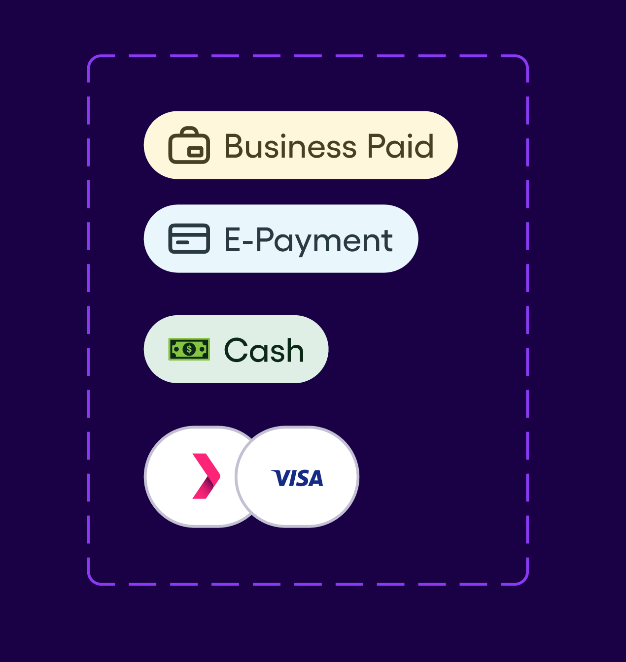
Payment methods
Design System
Dynamic Button Biggest funnel, easy acquisition, clarity, attracts attentionWe used a dynamic entry point to increase Radar discoverability without permanently occupying screen space.
The button adapted between collapsed and expanded states, revealing the number of available rides when there was activity. This created a lightweight sense of urgency while keeping the home screen clean.
The mechanism was also tied to the driver’s availability status: when drivers were online, Radar could surface active opportunities; when they were offline, the entry point stayed inactive to avoid misleading them.
adding to the pulse a subtle animated stroke to enhance the effect of the radar scanning.
The button toggles between collapsed and expanded state after ‘X’ seconds to show the user the number of available rides.
The Pulse is the pumping heart of the UI


Reusable card pattern
The Radar card is one of the most complex patterns in our library. It is tied to so many other foundational features of the product, pricing, boost feature, surge feature, Financial services,... Both building such versatile component and the Alignment with all respective stakeholders were undertaken with surgical precision.
Payment Methods
Main header component contains other nested components such as: Price, payment methods, commissions, rider information,...
Price Component


Rider Information component
Address list component

Main header component contains other nested components such as: Price, payment methods, rider information,...
Results
90%+
Driver engagement increased from ~75% daily average to 90%+
↑
Significant increase in radar acceptance / fetched rides
x2
Radar acceptance vs regular acceptance nearly doubled
Radar Deployment
Daily driver engagement with Radar after the Radar V2 launch increased from ~75% to 90%+. Radar acceptance also nearly doubled compared to regular ride acceptance during the observed period. All market-level details are anonymized.
Beyond Radar
Boosting the “Boost feature”
Revamp of the pricing component by adding our brand new green tokenWe later seized the opportunity of a very high adoption of the Radar and introduced a slight change to the UI of the pricing component to try to solve the low adoption occurring in the boost feature during the rider’s trip request and increase awareness of th feature.

“2nd Milestone”
Regular ride requests
As we speak, another milestone was reached as all stakeholders agreed to utilise the same radar card design for regular ride requests outside the Radar. The old design was too cluttered which led to high cancellation rates. Drivers usually prefer not to engage because of high cognitive load adding to that drivers are mostly in the car reading from a distance. For the same reasons, all labels failed to inform drivers of opportunities like: Commission reduction, payment methods, Best deals,... Seeing the impact of radar design spreading across the whole product was certainly a victory for the Mobility team, especially the ride requests flows which represent a pillar in our Partners App.


Home
Go Back Up
Next Case