Nassim Hadj benali


Sahal
A simple application that connects retailers and suppliers, allowing shop owners to purchase goods at competitive prices, with full transparency,
plus a free delivery service in less than 24 hours.
Open this case

Project Title:
Sahal
Operating on:
Mobile: Android/ iOS
Tablet: Android/ iOS
Project Description
In this project, we present “SAHAL” a smartphone application that connects retailers and suppliers, allowing shop owners to purchase goods at competitive prices, with full transparency, plus a free delivery service in less than 24 hours.
Client Name:
Yassir Inc., United States
Goal:
Reinvent wholesale for shop/Retailers owners
Client Name:
Fleap Technologies, Paris
Location:
United States
Project Date:
Jan 2021
Role:
Secondary User research, Interaction, information architecture, Visual Design, Prototyping, overall Art Direction. Within a team of seven; two front-end developers and two back end and a product manager.
Timeframe:
6 months
Understand

How might we relieve shop owners and retailers from the hustle of ordering their stock ?

Problem statement
Shop owners face many challenges sourcing goods, from finding the best prices to building reliable supplier relationships. Without a streamlined solution, they spend too much time negotiating, verifying quality, and coordinating deliveries.

Goals
- Connect retailers to suppliers
- Display a wide range of products in one place and with stable and transparent prices
- retailers can access all the history of his spendings and keep track of his inventory
- 24 hours delivery

Challenges
A diverse age and language group: some speak French, many Arabic, and others are bilingual. Older adults have low digital literacy. Offer a broad range of products and information.
Research & Analyse
“ To better understand the process in Algeria, on top of surveys, the team undertook careful observations of retailers going through the process of ordering their merchandise stock”
Personnas
We began with the creation of a general personna, from which we extracted three personas based off different common user needs:
private shop owner
Age: 30 - 60 years old
Low digital literacy
Has very little knowledge about business management
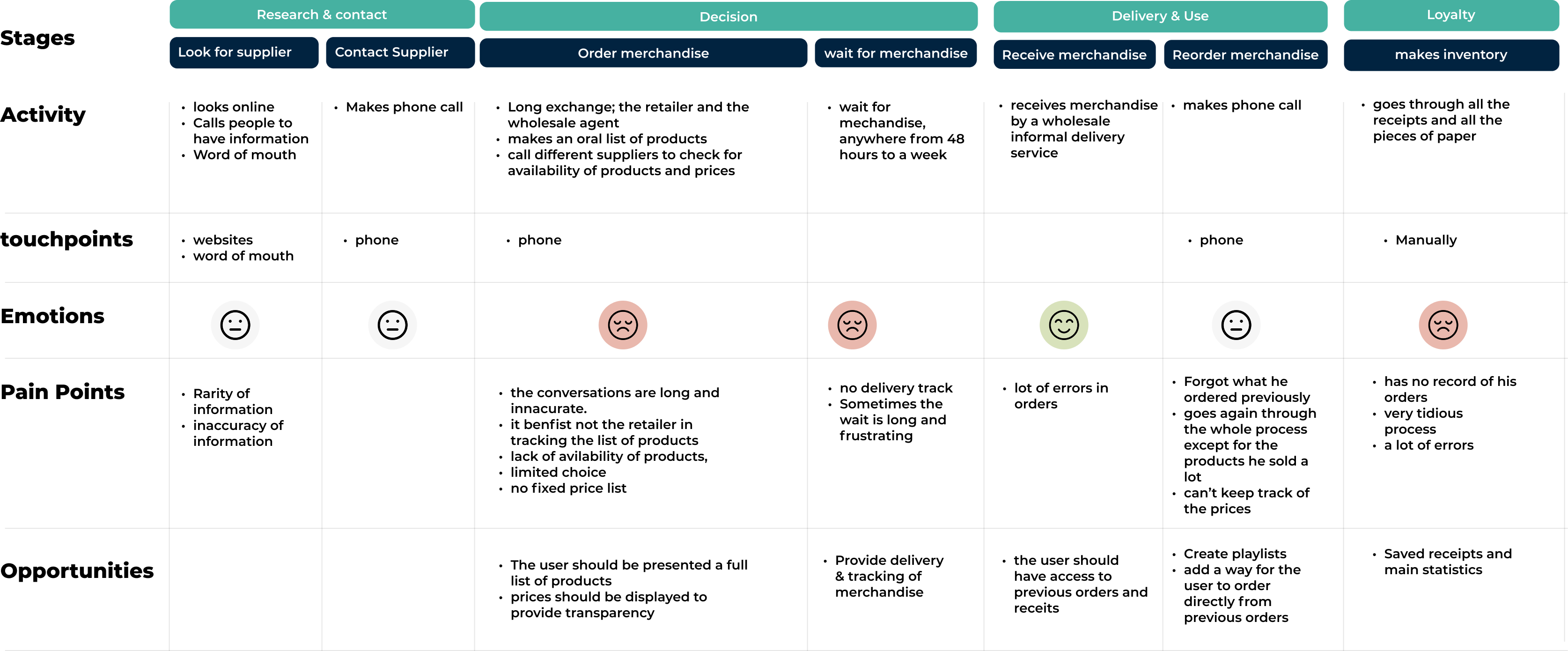
User Journey Map
Based off of the personas, my team and I created a consumer journey map that reflected the goals, feelings, and concerns of a user who would order merchandise in wholesale in Algeria.
By examining the journey map, we were able to locate identify the points of crisis within the user's journey, the process is tedious which prevents the retailer to achieve his business goals.
Ideate & Decide
“best case scenarios we had, the retailer has a stable contact with his supplier, but the process remains tedious and uncertain”
In order to determine the final flow of the ordering process, we have broken down the process to 3 steps:
Before / After
User story map
The process is intertwined and complex
- Look for suppliers
- contact one or many
- has to memorize the list of products
- Either gets delivered with no time frame
Or goes to grab it himself which is quite a loss for the business owner because he has to close down.

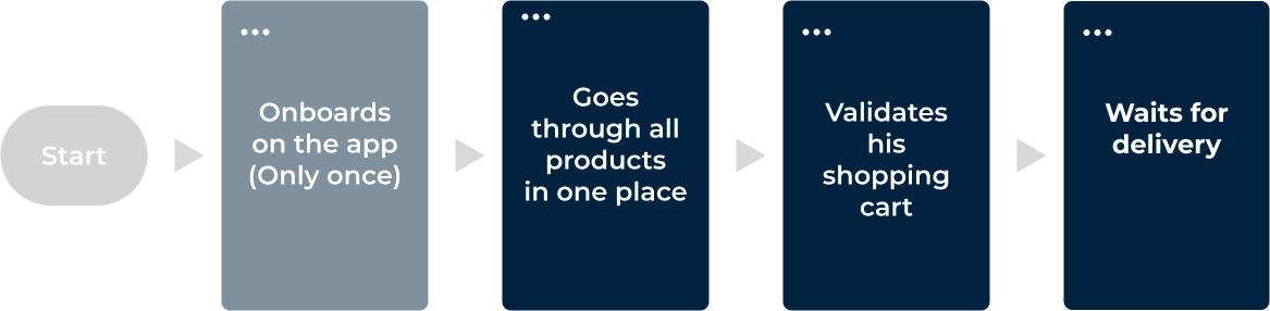
After
New User story map
The process is clearly less tedious
- The onboarding is done only once
- Products are gathered in one place with all their prices
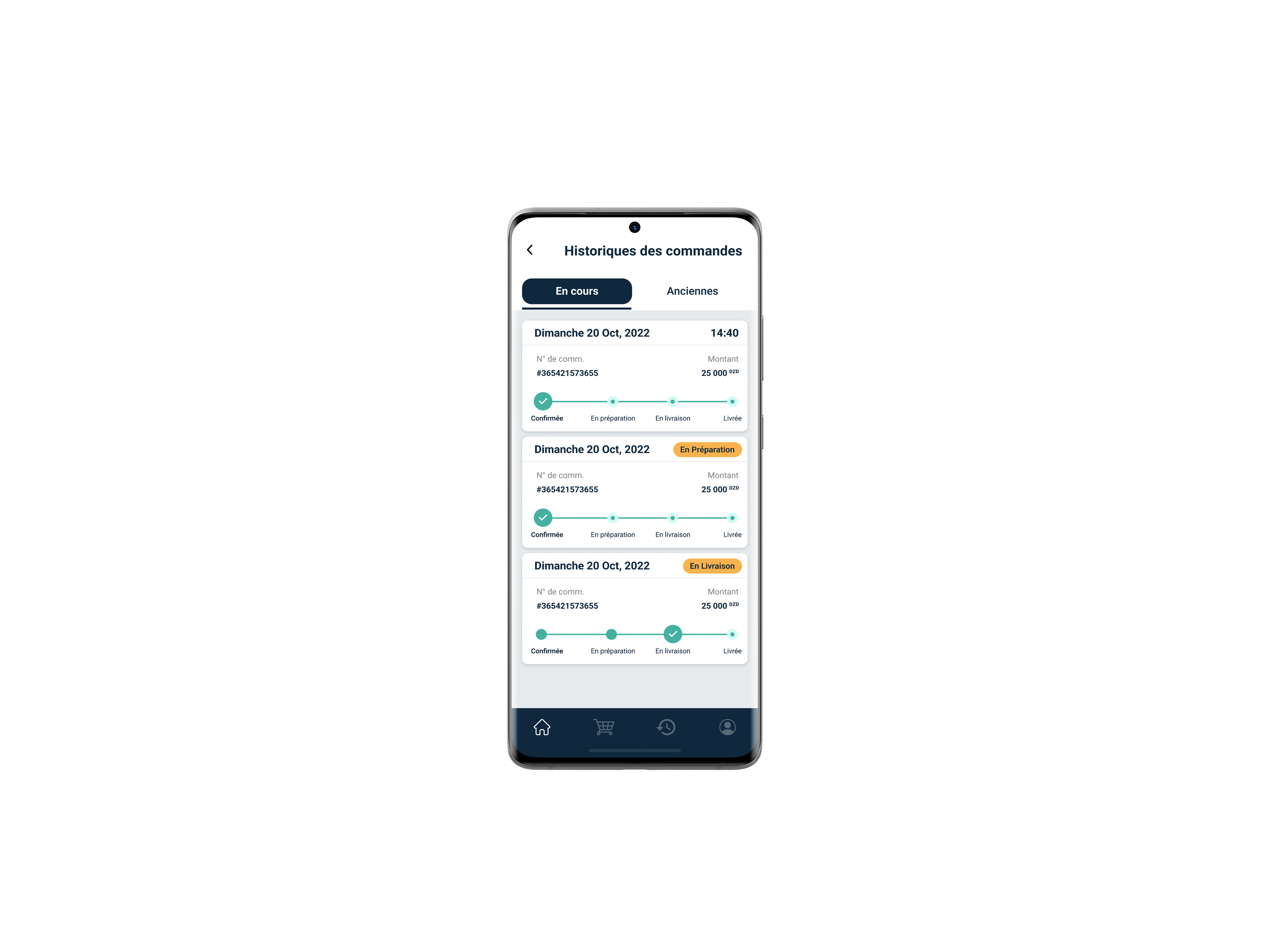
- controle over the order with the ability to edit, add or remove articles instantly
- The retailer is now able to track his delivery status.
Design process highlights
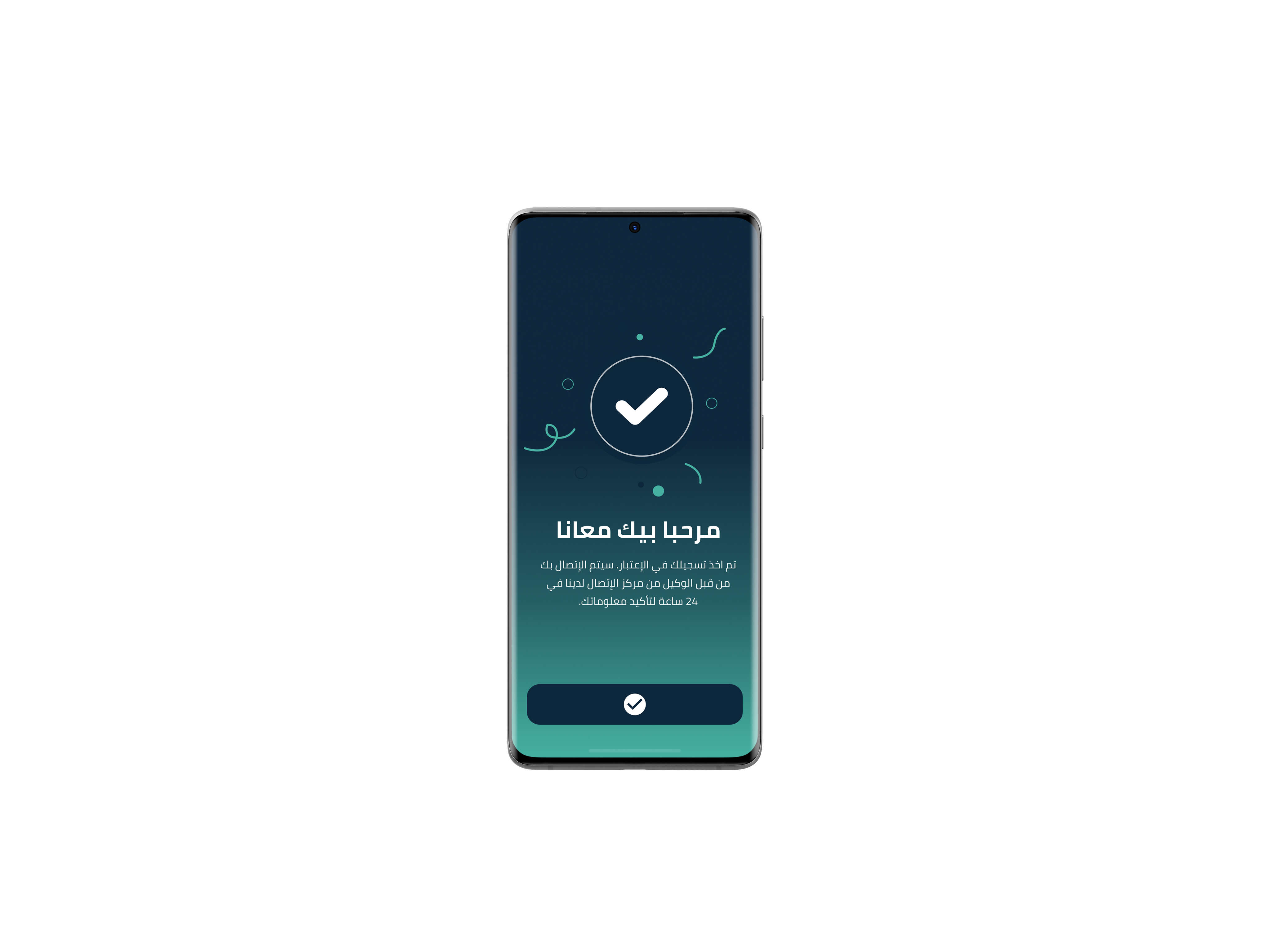
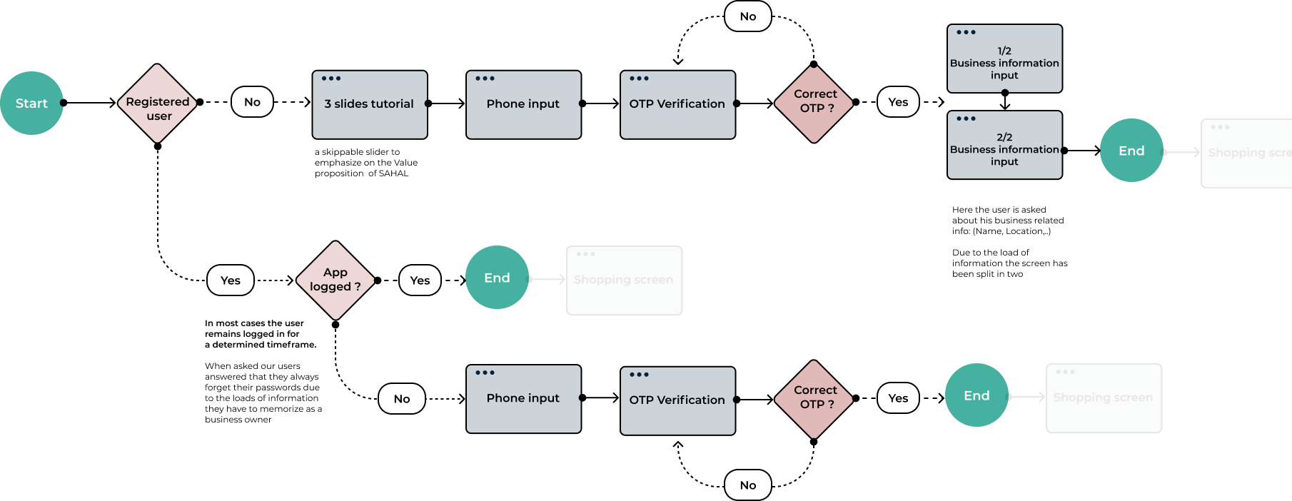
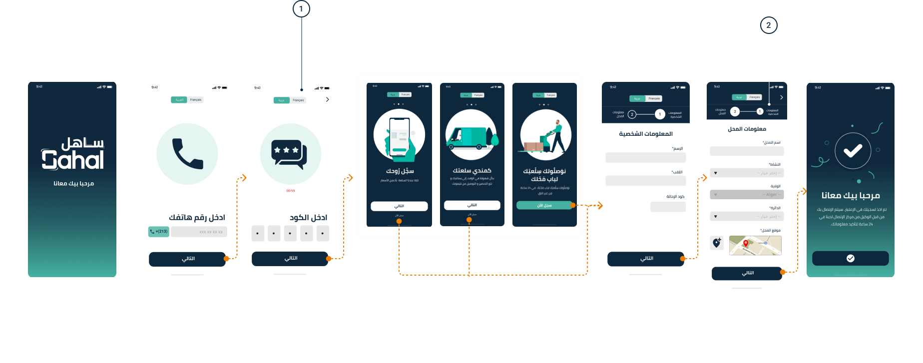
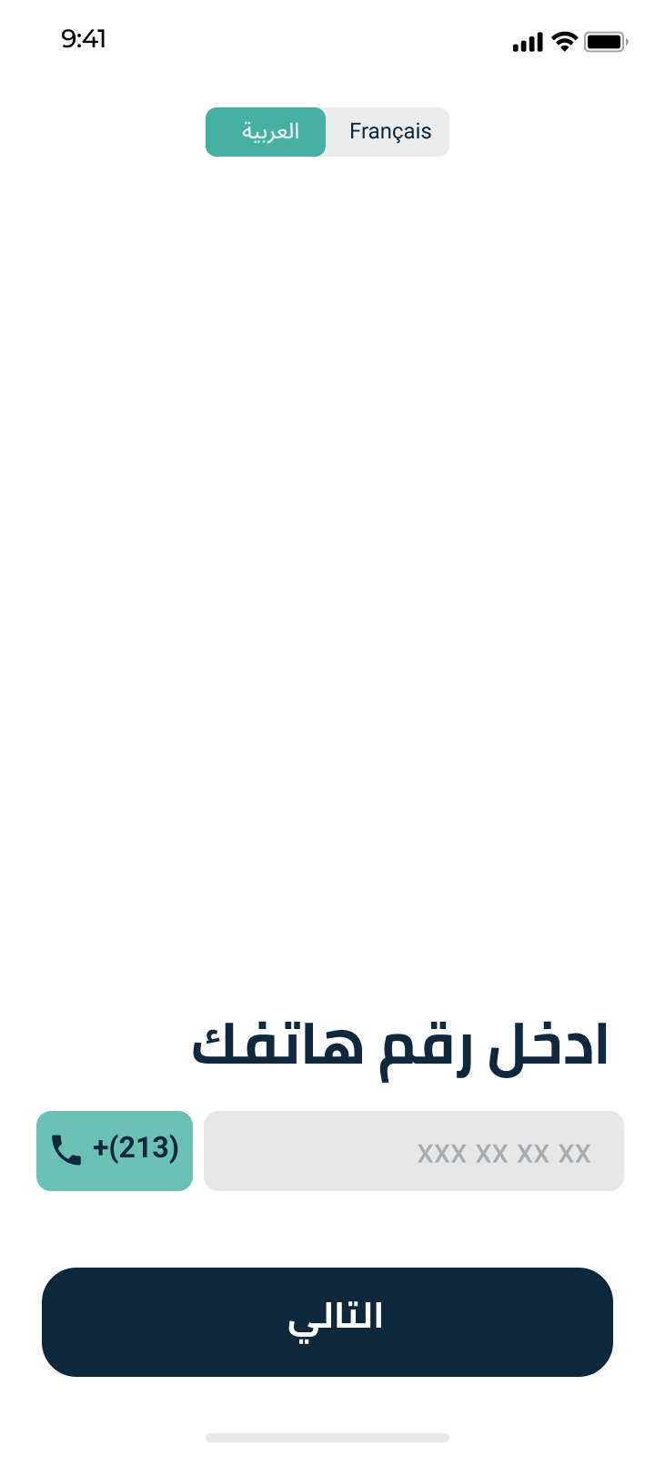
- Onboarding
The team chose OTP login for onboarding since many users had low digital literacy and often stopped using the app if they forgot their password.
In order to determine the final flow of the ordering process, we have broken down the process to 3 steps:

- Design system


1
Language switch
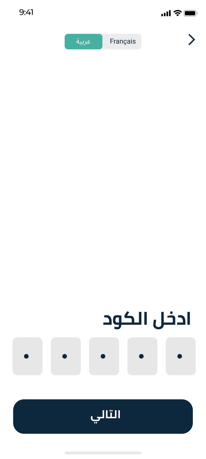
During surveys it turned out around 66% of retailers used arabic on their phones and 34% preferred the french language.
a toggle was designed to switch languages easily throughout the whole process of registration.
The user has the ability to change the langue in the settings later on.


1

2
المعلومات الشخصية
معلومات المحل


1
2
المعلومات الشخصية
معلومات المحل
2
Progress indicator
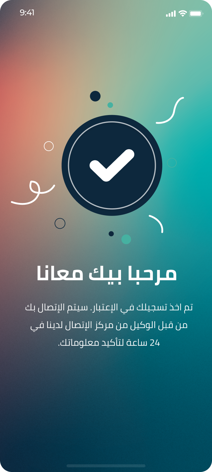
In order to complete registration the user has to fill minimum information about his business for us to collect data and
a progress bar is designed to inform the user that the registration process is in two steps only.
Design process highlights
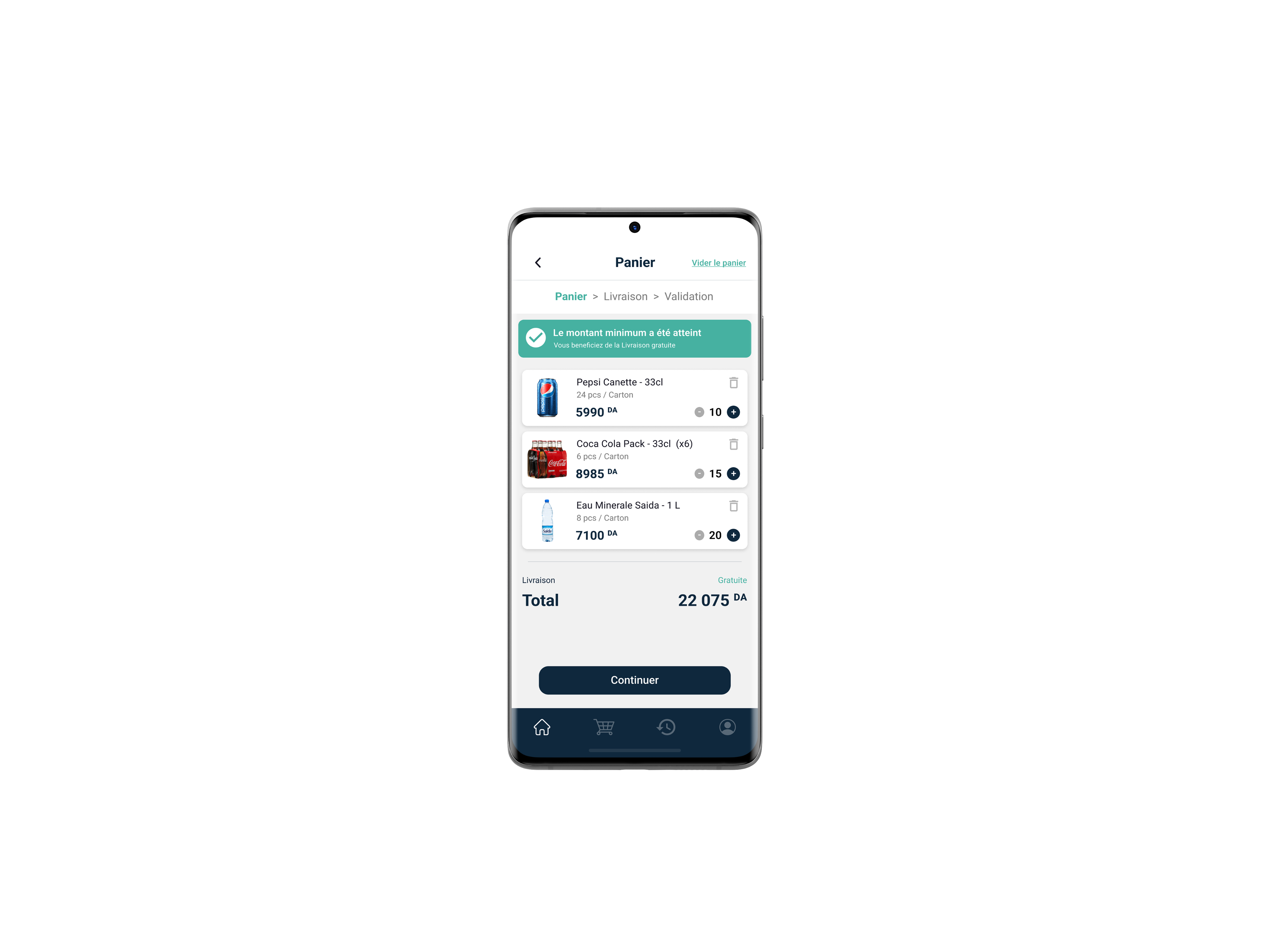
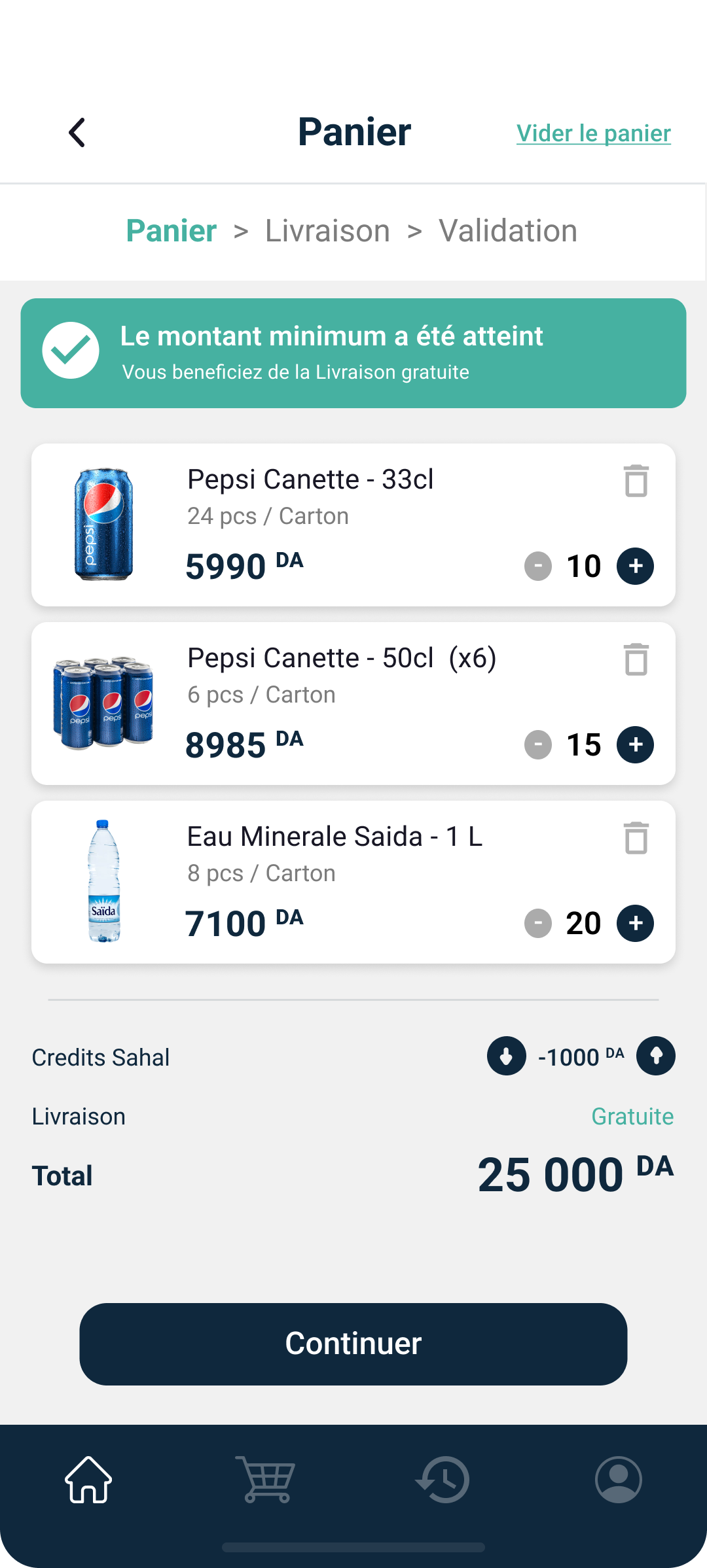
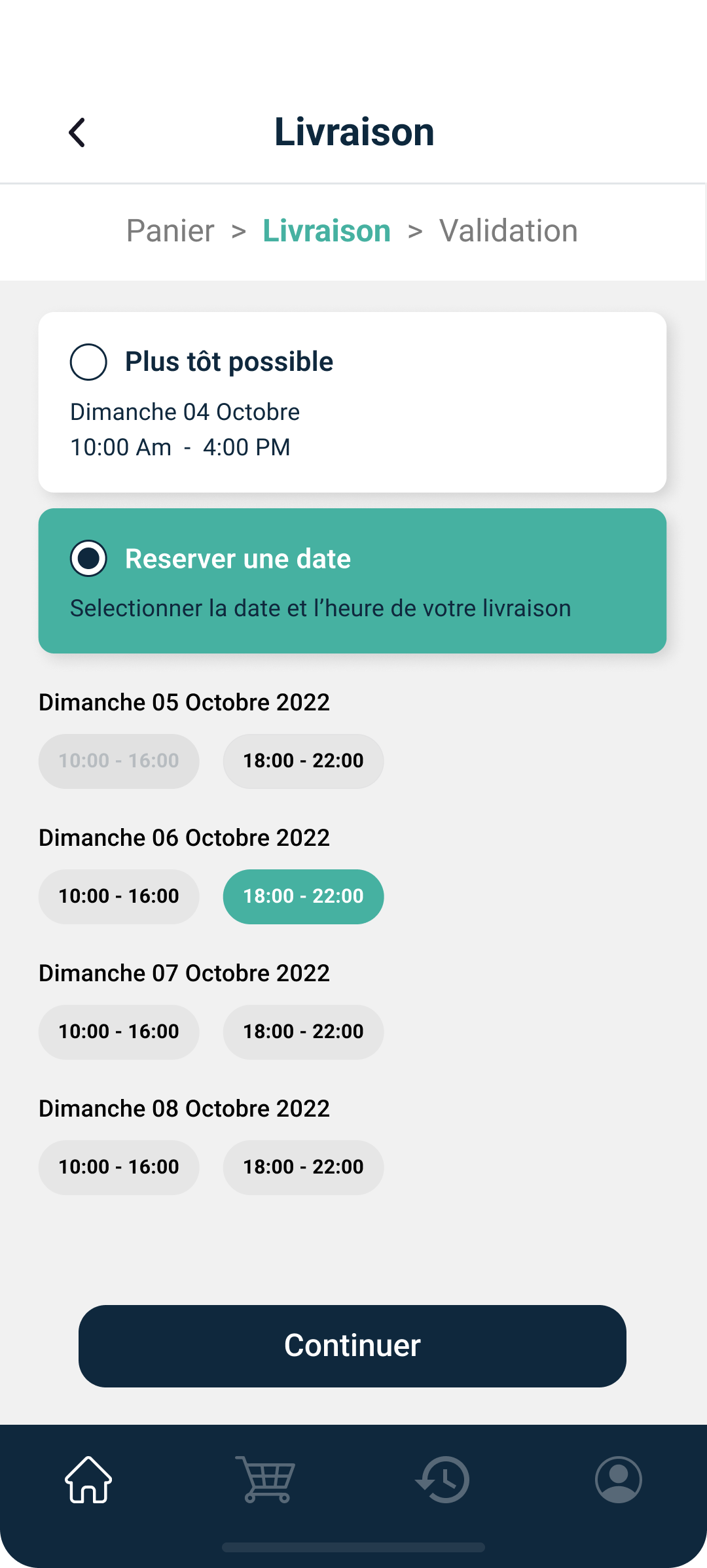
- Ordering
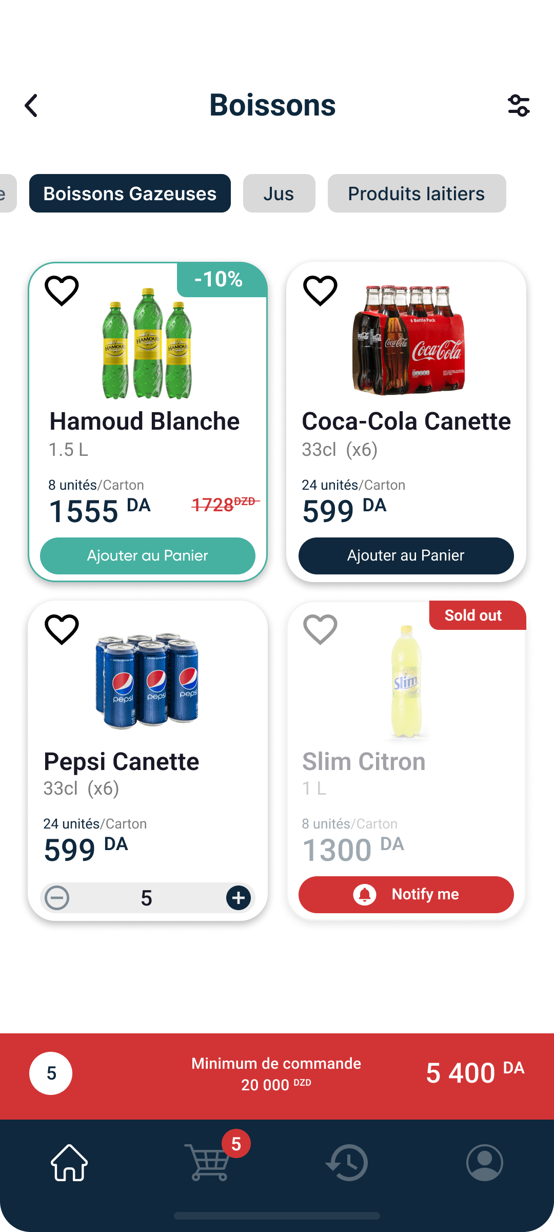
We optimised the order flow despite the challenge of the supplier's vast product range, making it easier for users to find what they need.
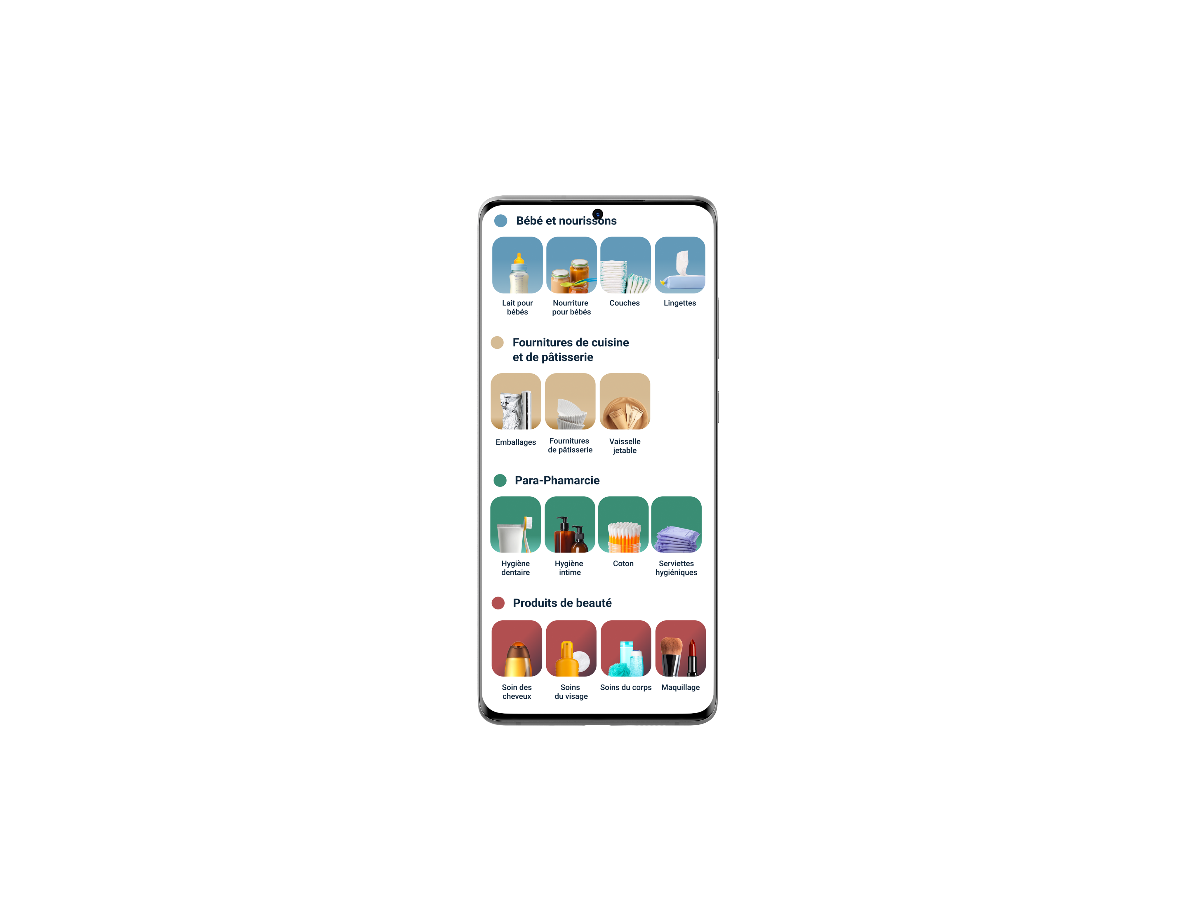
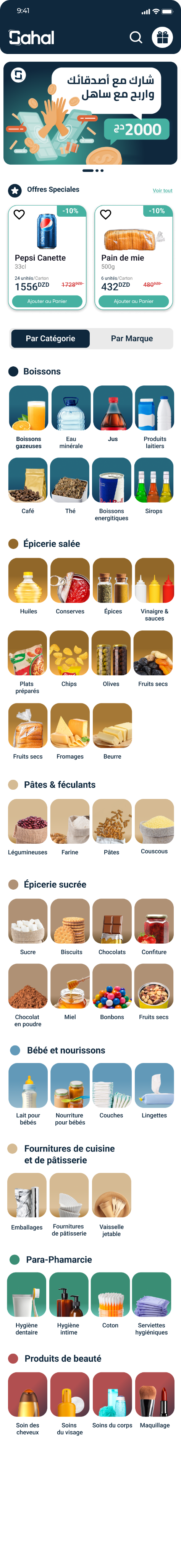
We first created a small database with all the categories and subcategories of products in order to group products in much fewer categories, with a set of subcategories displayed in tabs

Start


End


Products
by category

Products by brand

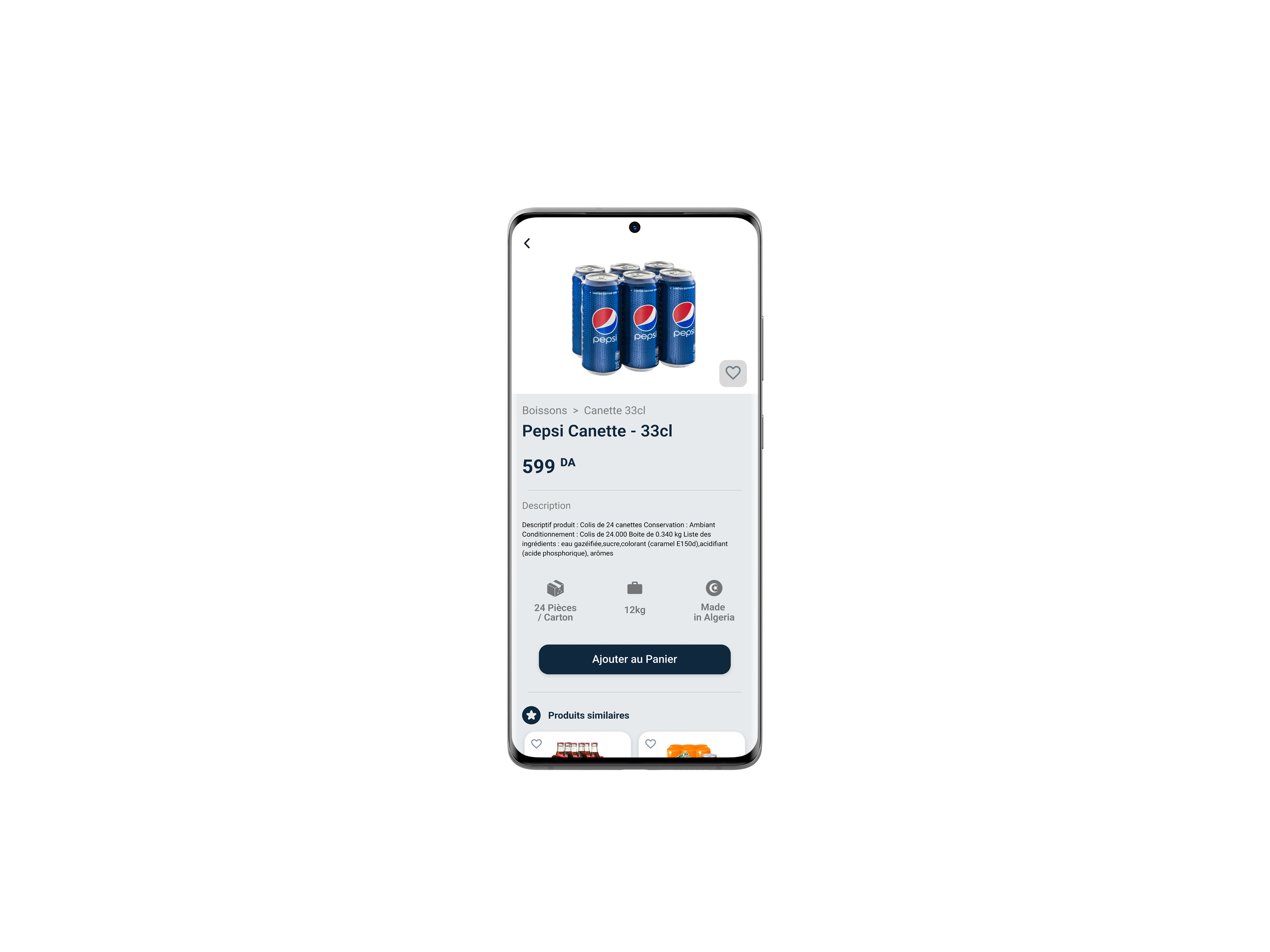
Product details

Product details

Product search

in-category
Product list

1/3
View in cart
3/3
Validation

2/3
Delivery
Views Product
adds Similar products

Adds product
Chooses
Category
/ brand
Adds product
Adds product


3

1

4


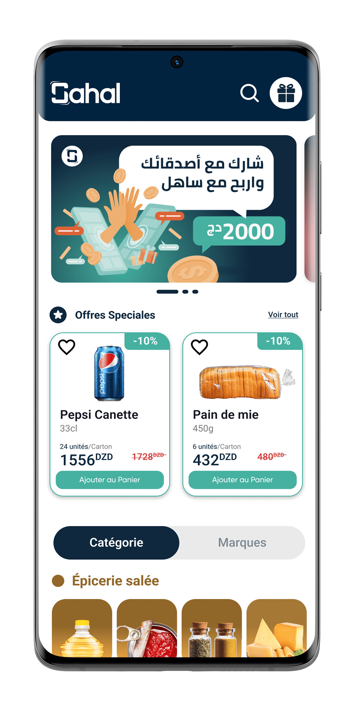
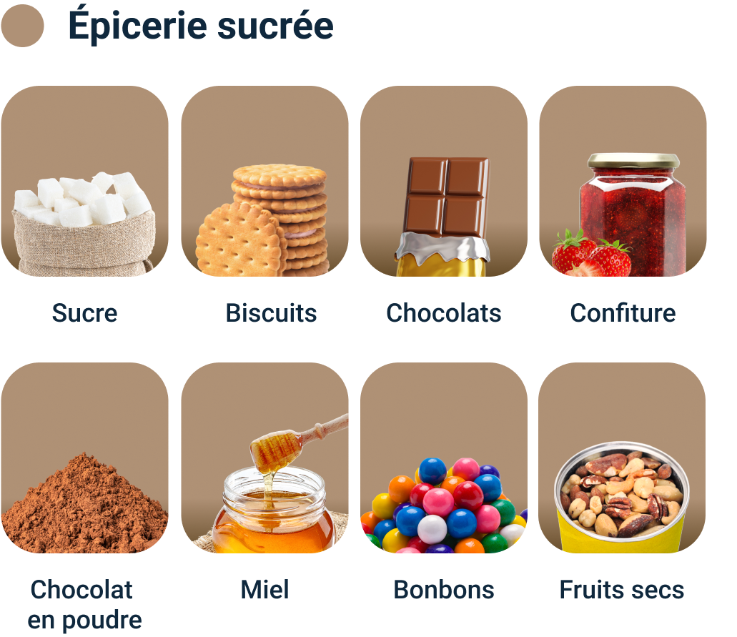
To reduce cluttering the list of products was divided into smaller sections and distinctive colors were assigned to each category
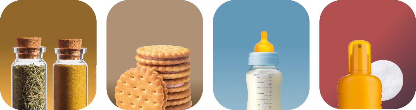
Each category icon is composed of two parts:
- A subtle gradient background
- An isolated representative product holding approx. 60% of the icon height
- approx. 33% negative space for breathing.
Category icons

2
18 px

W: 106 px
H: 120 px
Background: White
Padding
Top: 24px
Bottom: 24 px
Sides: 12 px


Brand icons
Logos should be square and cropped to the edges
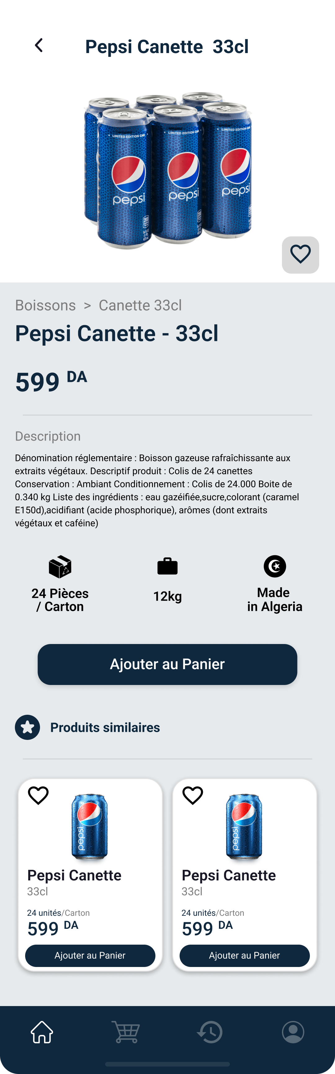
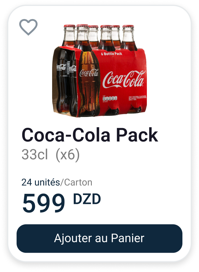
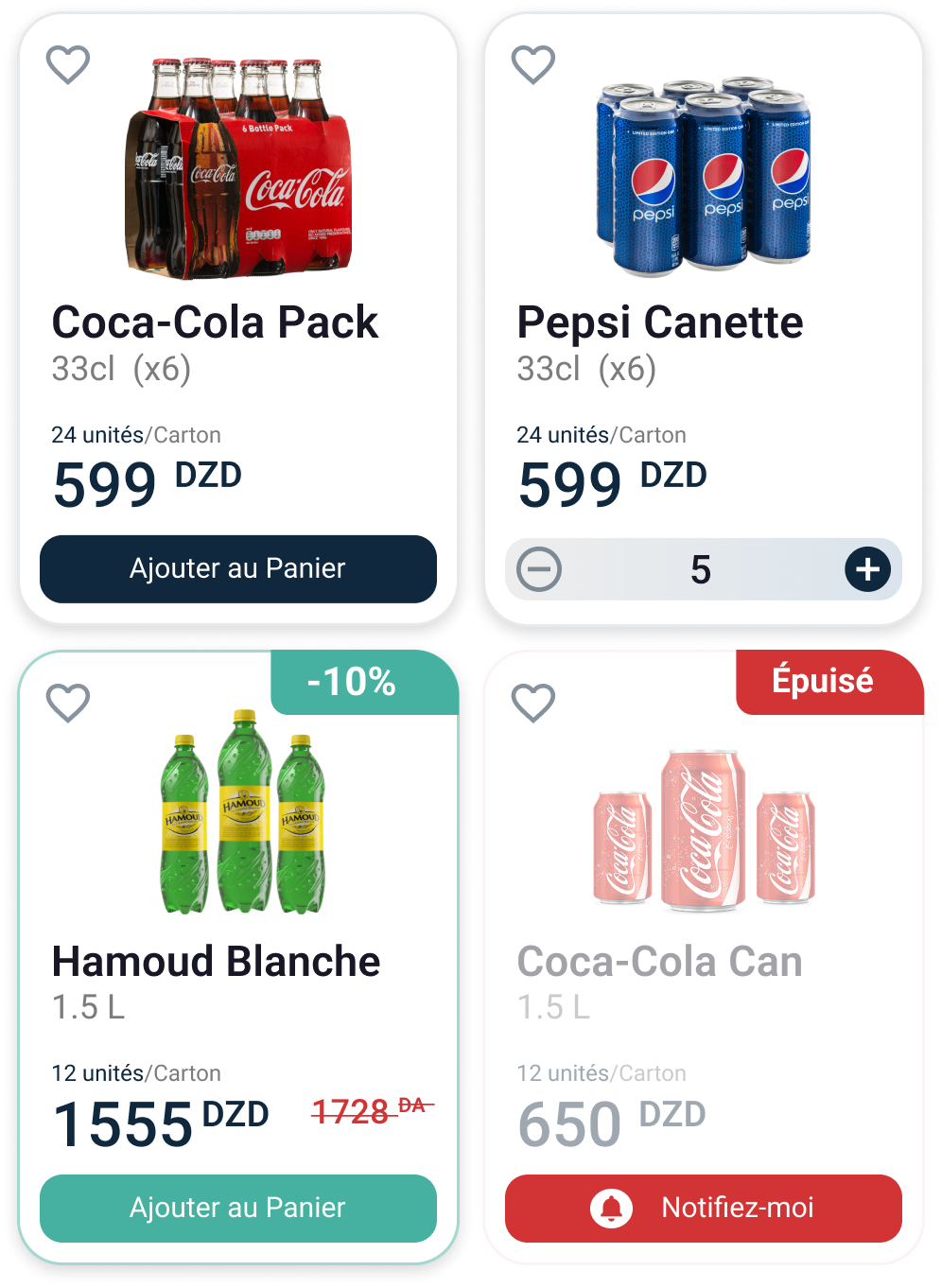
Main Card: The user is able to add products on the go while they are scrolling. The button is a two-state button, steppers are displayed and the user is able to choose the desired quantity.
Promotion Card: We wanted the user to quickly distinguish products in sale.
SOLD OUT Card: The user can be notified about the availability of a specific product when sold out.
Product cards

4
8 px
12 px
12 px
8 px
4 px
4 px
8 px
Packshot
33%
outerRadius (16 px)
Gap (8 px)
innerRadius (8 px)
- =
16 px
Product info
Call to action


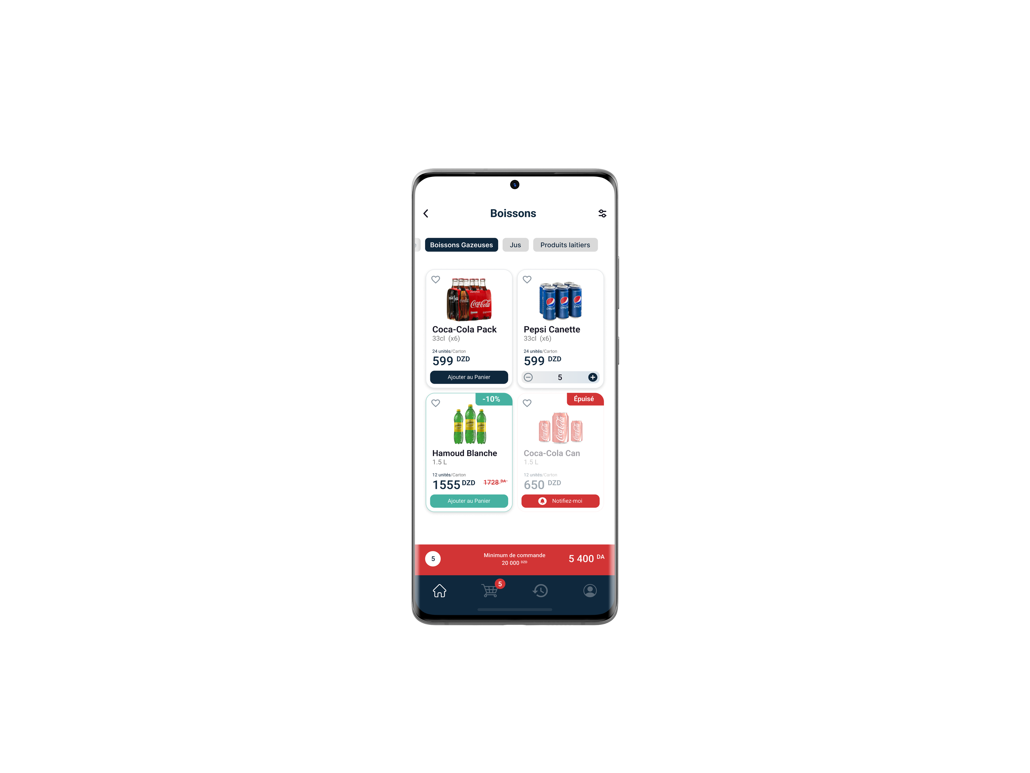
A horizontal scrollable list of tabs for easy navigation inside a category. The user no longer needs to leave the screen in order to change the subcategory.
Sub categories as tabs
Eau Minérale
Boissons Gazeuse
Jus
Produits laitiers

3

The challenge was to display both brands and categories of products in one screen.
Categories alone were about 60 in the beginning, let alone the number of brands in stock.
The permanent tab switcher comes in handy for the user to look for products by category but also by brands.
Main Tab Switcher

1

32 px
16 px
16 px
16 px
8 px
8 px

Par Catégorie
Par Marque


Home


Go Back Up
Next Case